Vaccay
Overview
Create an Innovation Digital technology for traveling for Designated Areas for Sustainable Tourism Administration (DASTA)
Project detail
First Round:
May- August 2021
Final Round:
August 2021
First runner-up
Team:
Nawamon C.
Tanaporn L.
Background

Designated Areas for Sustainable Tourism Administration (DASTA)/ องค์การบริหารการพัฒนาพื้นที่พิเศษเพื่อการท่องเที่ยวอย่างยั่งยืน (องค์การมหาชน) หรือ อพท. organize a national contest for Innovative Tourism Project Pitching 2021 for new normal way of traveling in order to
-
Support local store
-
Help travellers to easily access to local Information
-
Innovation go along with new normal way of traveling.
By choosing one of the district and create a mock-up application.
Discover and Research
In 2019, Thailand's income is from travelers around 3 million million baht. When Covid-19 hit the world in the end of 2019 every business is affected especially traveling. Small or big businesses suffered from this pandemic. Although the covid-19 situation is going to solve but traveling might not get better as fast as we think, the chance that this will come back to normal is hard so we create this digital innovation to help.
We start by doing research on Thailand's tourism effect by covid 19 and also launching an online survey asking questions about why people are afraid of traveling during is time.

We decide to choose the second problem because it is the initial problem that make people afraid to go out.
Empathize
We conduct the survey to gather user insight by focusing on the opinion of crowdness

Question for survey


With the total of 168 participants to the survey. We decide our target users will be 18–35 years old people because it is the age that most familiar with technology. They trust the internet to be the guide. From the survey of 168 people, there are 126 people or 80% that rely on internet when travelling and only 1 person or 2.22% that use application.
And this is interesting because most people use internet to be the main tool and most of the times we use same website since there is not many relaible/good website out there so this make them go to the same source and at the end they end up in the same place.
Define

When traveling most of the time we use internet to be our guide. We open the same website to guide us to restaurants and landmark so the information usually the same. So many times we got to destination but the place is so crowded, has to stay in the line for table at restuarants for hours which is frustrated and dangerous since poeple still panic about the corona virus. The place is jamed with travelers, no social distancing so we come up with idea.
How Might We Reduce Tourist Congestion
With if users can know how crowded the destination place before going and can choose other places that have the similar result to the first one therefore this way travelers can scatterd to different places and this mean local stores around will get benefit.

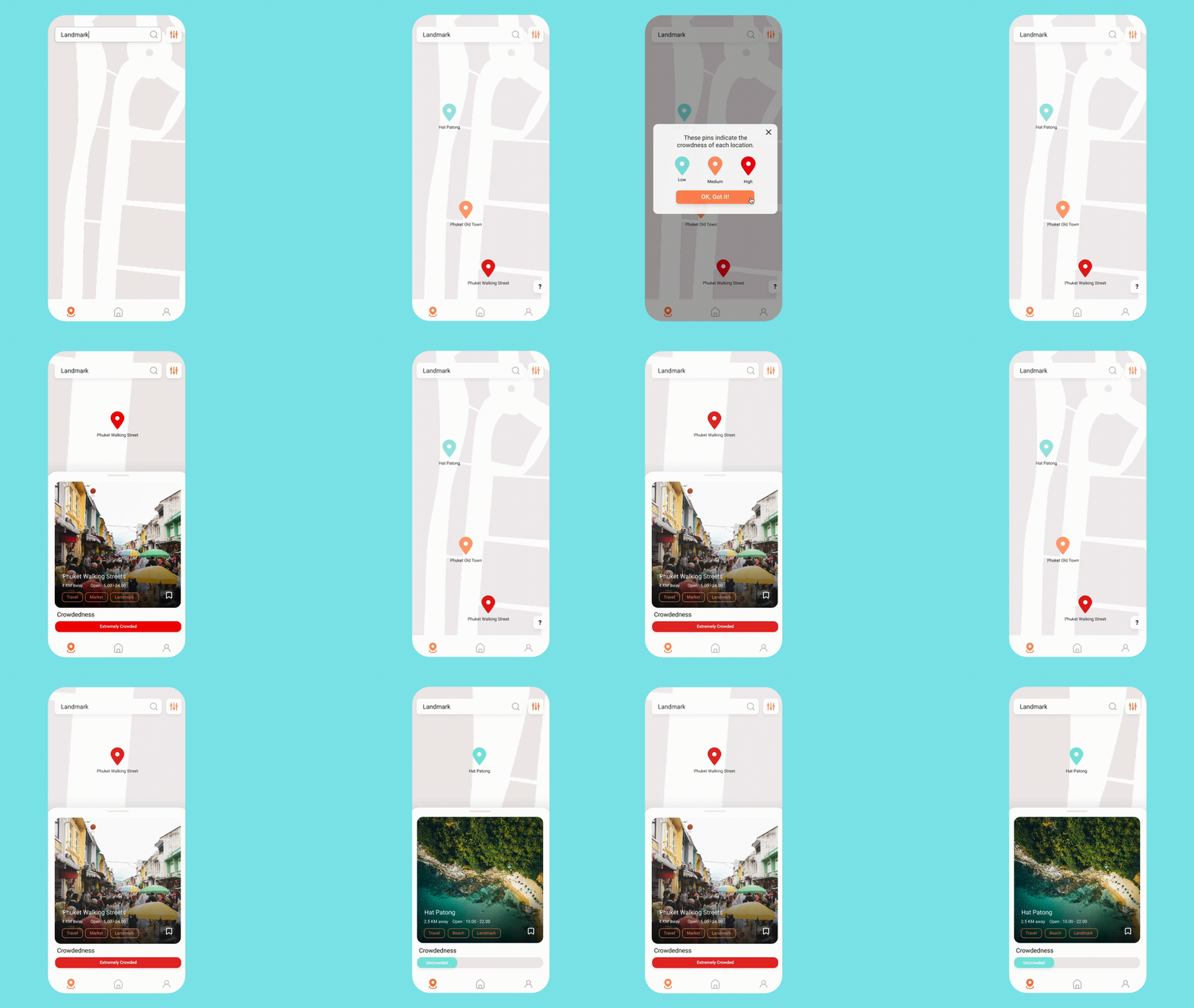
We come up with an application that can specify the crowdedness in each place and also recommend similar landmarks, restaurants. This way to avoid crowdedness and also to distribute the income to local stores.

The current innovation in the market can locate the location but hardly the crowdedness and the lifestyle application like Wongnai mainly focus on reviewing the quality of food.
Ideate

Sitemap

Wireframe
We come up with different names but the final one is VACCAY, A short word form vacation and the tagline:
Flee and Free from crowd
To emphasize that this app is design for travellers to help them travel safety and happy through out the trip. The colors bright blue and orange are inspired from colors of the sea and sunset. The logo checkmark actually inspired from shape of people.
Art direction

Visual and Logo development

Search page and review

Renovate Version

After first round contest we decide to change some look of the interface. We add tutorial page, homepage and more pictures into the app since this is a travel application we should present beautiful pictures to help promote the places. Our main goals are to help users feel safe while traveling in post Covid-19 situation and to help promote local store.

The old version (left) doesn't emphasize our main feature which is the bar of Crowdedness so we change to the one on the right which has bigger pictures of the landmark and bar of crowdedness which is the thing that we think the users want to see first and when drag up users can still see contact information, direction, similar places and review of the place just like the old version.


